Not logged in
FAQ  •  Advanced search  •  Login

[16 x16] HPHearts

Moderator: Map Officer

What do you think, do you like it?

Yes, absolutely! =D
1
9%
Yes, but the design is not so good. =)
3
27%
Yes, but the path is not so good. =)
0
No votes
I don't know... =/
1
9%
No, but at least the design is not so bad... =(
0
No votes
No, but at least the path is not so bad... =(
1
9%
Hell no! Seriously... what's this? O_o
5
45%
 
Total votes : 11
<<

HPoltergeist

Fast Nova
Fast Nova

Posts: 35

Joined: 05.02.2013, 09:44

Location: Hungary

Post 08.02.2013, 14:08

[16 x16] HPHearts

Hi!

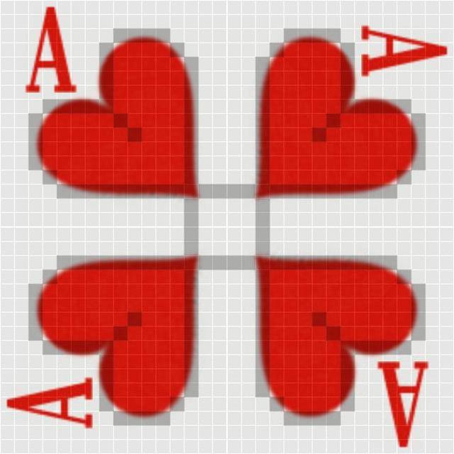
An other simple design. =)

Entering on the right side, exiting on the bottom side, stopping for a total of 5 ticks in the middle, compensation for the diagonals... =P

- 16x16
- 51 path segments (47+4 in the middle)
- no blocked spaces
- stopping in the middle

Image

Image

HPHearts.zip
Map package - HPHearts
(10.33 KiB) Downloaded 26 times


Any feedback is welcome! =)

Thanks,

HPoltergeist
--- Poltergeist Minecraft Server ---
Dynmap: http://poltergeist.dyndns-server.com:8123
- Whitelisting: bnorbee [at] freemail [dot] hu -

Sponsor

Post 08.02.2013, 14:08

Re: [16 x16] HPHearts

<<

Pezinator

User avatar

Express Raptor
Express Raptor

Posts: 1254

Joined: 11.03.2012, 20:27

Post 09.02.2013, 14:48

Re: HPHearts (16x16)

Hmmm. Actually i have to say, that I expected something better. I am really not satisfied with this map.

The white background is not ideal, since we got white creeps.

The path is not really special and most of all you should make a diagonal path if there is a diagonal path, not just squares. That doesn't look good.

The Design idea is nice, but you see the pixel, so the quality is not good enough and I don't like the A when it get's turned.

But in the end i have to say, that i like how the hearts look on the 4v4.
"Have no fear of perfection; you'll never reach it."
<<

HPoltergeist

Fast Nova
Fast Nova

Posts: 35

Joined: 05.02.2013, 09:44

Location: Hungary

Post 09.02.2013, 16:39

Re: HPHearts (16x16)

Pezinator wrote:Hmmm. Actually i have to say, that I expected something better. I am really not satisfied with this map.

The white background is not ideal, since we got white creeps.

The path is not really special and most of all you should make a diagonal path if there is a diagonal path, not just squares. That doesn't look good.

The Design idea is nice, but you see the pixel, so the quality is not good enough and I don't like the A when it get's turned.

But in the end i have to say, that i like how the hearts look on the 4v4.


The background on the path is not white. It's grey. =P

I made these squares on purpose, to keep the grid, because it can't be seen almost anywhere.

I wrote in one of my earlier posts, that I can do nothing with the quality because --- it's in the map creation guidlines, here in the map forum, that the jpeg must be 75% --- This is a 75% jpeg. =)

Anyway thanks, for the feedback! =)

Edit:
I made this map as an experiment, just for fun... =P
--- Poltergeist Minecraft Server ---
Dynmap: http://poltergeist.dyndns-server.com:8123
- Whitelisting: bnorbee [at] freemail [dot] hu -
<<

Seraph07

User avatar

Mothership
Mothership

Posts: 2785

Joined: 09.07.2011, 13:26

Location: Hildesheim

Post 10.02.2013, 11:32

Re: HPHearts (16x16)

You can post the map with 100%, we need the little one for the game, not for the presentation.

I like the path, quite new deffspot.

I dont like the design, it is not good looking, you can make this better.^^
<<

Flipper

Ray
Ray

Posts: 141

Joined: 23.08.2012, 02:52

Post 12.02.2013, 18:54

Re: HPHearts (16x16)

I have to agree with Seraph, I like the path and the Heart concept.
I would ditch the A; the heart can survive without it.

The path/graphic combination is hard to get together..goood first attempt but I think it needs some tweaking to get the path to somewhat disappear... Perhaps a lacey design?valentine lace heart But then again the white will hide white creeps, red will hide red creeps.
<<

Seraph07

User avatar

Mothership
Mothership

Posts: 2785

Joined: 09.07.2011, 13:26

Location: Hildesheim

Post 13.02.2013, 17:29

Re: HPHearts (16x16)

A valentine cart would be a good idea you earn a neutral backgroundcolor = rosa / pink.
As Flipper already noticed, a different pathcolor would destroy the valentinambiente.

We could improve the themes to be more compatible with mapdesigns but this is a different discussion.

I think we should get over the idea to create a heart background and just use the path for the heart.
This way we have much more options to create a nice design.
<<

Seraph07

User avatar

Mothership
Mothership

Posts: 2785

Joined: 09.07.2011, 13:26

Location: Hildesheim

Post 22.01.2017, 14:29

Re: [16 x16] HPHearts

Path is ok, would be better if it starts at the bottom.
Design is not ok. Some towers are not visible on the red background.

Still an interesting path.

Return to Need improvement

Who is online

Users browsing this forum: No registered users and 7 guests

© CreepTD.com · Powered by phpBB · Style by ST Software