Page 1 of 1

[16 x16] HPHearts

PostPosted: 08.02.2013, 14:08
by HPoltergeist
Hi!

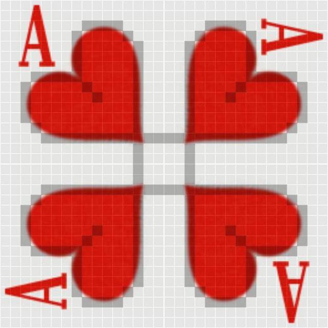
An other simple design. =)

Entering on the right side, exiting on the bottom side, stopping for a total of 5 ticks in the middle, compensation for the diagonals... =P

- 16x16
- 51 path segments (47+4 in the middle)
- no blocked spaces
- stopping in the middle

Image

Image

HPHearts.zip
Map package - HPHearts
(10.33 KiB) Downloaded 43 times


Any feedback is welcome! =)

Thanks,

HPoltergeist

Re: HPHearts (16x16)

PostPosted: 09.02.2013, 14:48
by Pezinator
Hmmm. Actually i have to say, that I expected something better. I am really not satisfied with this map.

The white background is not ideal, since we got white creeps.

The path is not really special and most of all you should make a diagonal path if there is a diagonal path, not just squares. That doesn't look good.

The Design idea is nice, but you see the pixel, so the quality is not good enough and I don't like the A when it get's turned.

But in the end i have to say, that i like how the hearts look on the 4v4.

Re: HPHearts (16x16)

PostPosted: 09.02.2013, 16:39
by HPoltergeist
Pezinator wrote:Hmmm. Actually i have to say, that I expected something better. I am really not satisfied with this map.

The white background is not ideal, since we got white creeps.

The path is not really special and most of all you should make a diagonal path if there is a diagonal path, not just squares. That doesn't look good.

The Design idea is nice, but you see the pixel, so the quality is not good enough and I don't like the A when it get's turned.

But in the end i have to say, that i like how the hearts look on the 4v4.


The background on the path is not white. It's grey. =P

I made these squares on purpose, to keep the grid, because it can't be seen almost anywhere.

I wrote in one of my earlier posts, that I can do nothing with the quality because --- it's in the map creation guidlines, here in the map forum, that the jpeg must be 75% --- This is a 75% jpeg. =)

Anyway thanks, for the feedback! =)

Edit:
I made this map as an experiment, just for fun... =P

Re: HPHearts (16x16)

PostPosted: 10.02.2013, 11:32
by Seraph07
You can post the map with 100%, we need the little one for the game, not for the presentation.

I like the path, quite new deffspot.

I dont like the design, it is not good looking, you can make this better.^^

Re: HPHearts (16x16)

PostPosted: 12.02.2013, 18:54
by Flipper
I have to agree with Seraph, I like the path and the Heart concept.
I would ditch the A; the heart can survive without it.

The path/graphic combination is hard to get together..goood first attempt but I think it needs some tweaking to get the path to somewhat disappear... Perhaps a lacey design?valentine lace heart But then again the white will hide white creeps, red will hide red creeps.

Re: HPHearts (16x16)

PostPosted: 13.02.2013, 17:29
by Seraph07
A valentine cart would be a good idea you earn a neutral backgroundcolor = rosa / pink.
As Flipper already noticed, a different pathcolor would destroy the valentinambiente.

We could improve the themes to be more compatible with mapdesigns but this is a different discussion.

I think we should get over the idea to create a heart background and just use the path for the heart.
This way we have much more options to create a nice design.

Re: [16 x16] HPHearts

PostPosted: 22.01.2017, 14:29
by Seraph07
Path is ok, would be better if it starts at the bottom.
Design is not ok. Some towers are not visible on the red background.

Still an interesting path.