Page 1 of 3
Raceday [16x16]

Posted:
30.06.2013, 20:11by xdXP
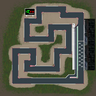
My first work. =]
Thx for dcode for the great help on shader effects and the new stand

Re: Raceday [16x16]
Posted:
01.07.2013, 13:47by Jolene
i think start and ending need to connect to those of the other players.
Re: Raceday [16x16]
Posted:
01.07.2013, 15:37by manuel
Not necessary, if the map doesn't touch the edges.
Re: Raceday [16x16]
Posted:
01.07.2013, 15:54by lFelck
Nice idea for the path, but the design is terrible.^^
Maybe, if the curves are round and there's a nice backround...
Re: Raceday [16x16]
Posted:
01.07.2013, 15:59by manuel
Design should be better, but I would not use curves.
Re: Raceday [16x16]
Posted:
01.07.2013, 19:21by xdXP
the original file of the map is on .bmp but the site doesnt support that kind of file.
and i changed to .png but it lost some quality
Re: Raceday [16x16]
Posted:
01.07.2013, 19:32by lFelck
You can change to png without loosing quality.
Somewhere (depending on your program) should be an option to select how strong it will be compressed (don`t compress

).
Re: Raceday [16x16]
Posted:
01.07.2013, 19:47by MFG659
Good idea.
Can you also change the direction of the road of clockwise into counter clockwise (because the plaque of CreepTD is showing a mercury, wich is looking left) and you should round off the corners.
Re: Raceday [16x16]
Posted:
01.07.2013, 19:48by xdXP
Here is the original file
every time i change it compress and quality lost =[
Re: Raceday [16x16]
Posted:
01.07.2013, 19:49by xdXP
the original logo of the game is that

Re: Raceday [16x16]
Posted:
01.07.2013, 19:52by MFG659
xdXP wrote:the original logo of the game is that
Yes, I know it with the logo
(my english is not so good

).
Re: Raceday [16x16]
Posted:
01.07.2013, 19:58by xdXP
no i understand wrong your question xD
yes it´s possible to change but that way the last part of the map has worse building spots to build
like less range and every player likes to def almost in the end of the map
so if i changed to counter clockwise you would have to build more because it has worse building spots in the end
Re: Raceday [16x16]
Posted:
01.07.2013, 20:14by dcode
Maybe a few highlights, like so?
Re: Raceday [16x16]
Posted:
01.07.2013, 20:17by MFG659
- No, I mean it so
- I mean so.png (130.32 KiB) Viewed 9838 times
The picture is saying it.
Re: Raceday [16x16]
Posted:
01.07.2013, 20:17by xdXP
dcode only needs to touch on something and turns that in to gold =]
Re: Raceday [16x16]
Posted:
01.07.2013, 20:21by lFelck
I like the lights from dcode, but the background looks "simple" and blurred.
Re: Raceday [16x16]
Posted:
01.07.2013, 20:21by xdXP
i know dude but now the last part of the map as worse build spots
Re: Raceday [16x16]
Posted:
01.07.2013, 20:23by lFelck
I agree with xdxp. Clockwise is the better direction.
Re: Raceday [16x16]
Posted:
01.07.2013, 20:48by Pezinator
Hmm why didn't you just let the map how it was. I don't understand why you didn't like the original design. Improving the black colours would have been the best thing to do. Now the design looks ugly. If you really want to follow the new idea. You need to make it the way NYC is. That means paint it on your own.
Re: Raceday [16x16]
Posted:
01.07.2013, 21:41by dcode
+ A bit sharper grass, a custom made terrace image and shadow on the sign.