Page 1 of 1
[added] Twosquares 16x16

Posted:
04.06.2012, 13:35by domitmn
Path: 57 Steps
Uncoloured squares are blocked for towers.
No tunnel.
V1
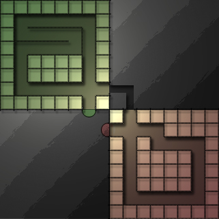
- twosquares.jpg (86.5 KiB) Viewed 8196 times
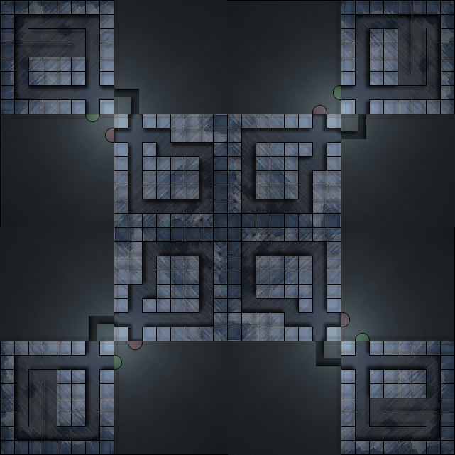
V1 4 Player View:
[spoiler]

- twosquares4player.jpg (287.28 KiB) Viewed 8196 times
[/spoiler]
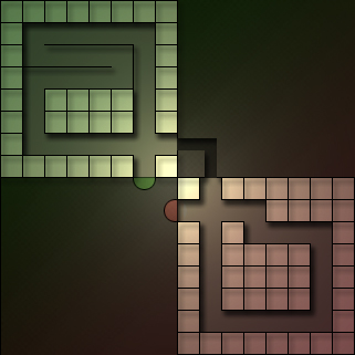
V2: [in a later post]
V3:

- twosquares_dark.jpg (88.12 KiB) Viewed 8137 times
V3 4Player
[spoiler]
- twosquares_dark4pl.jpg (306.89 KiB) Viewed 8137 times
[/spoiler]
Re: Twosquares 16x16
Posted:
04.06.2012, 15:51by Pezinator
I like the path. It's something new. There is only one thing i would change. Is there a possibilty that you can change the dots that mark the path and make a line instead? I would just like to see how that would look like.
Re: Twosquares 16x16
Posted:
04.06.2012, 16:01by domitmn

- twosquares_linie.jpg (66.89 KiB) Viewed 8179 times
Re: Twosquares 16x16
Posted:
04.06.2012, 16:04by Pezinator
thx. Like it much more^^. Makes the map look sharper! I really like it more.
Re: Twosquares 16x16
Posted:
04.06.2012, 17:26by dcode
Not so sure about the background, so I tried around a bit:
Re: Twosquares 16x16
Posted:
04.06.2012, 17:44by domitmn
I kind of liked the contrast of the "colorless" background and the rest.
Sorry, I don't like the clouds that much - so if a more colorful background is more appreciated I got this:
- twosquares_update2.jpg (66.11 KiB) Viewed 8163 times
Re: Twosquares 16x16
Posted:
04.06.2012, 18:00by Bianca1989
Mir gefällt an der Map überhaupt nichts, Design find ich nicht gut und den Pfad auch nicht, sieht meiner Meinung nach komisch aus. Und im 4er schaut das auch nicht sonderlich gut aus. Ich finde das kannst du besser.
Re: Twosquares 16x16
Posted:
04.06.2012, 19:07by Pezinator
Also in dem Fall weiß ich nicht, was dir im 4er nicht gefällt ich find der schaut irgendwie cool aus. Außer, dass die Streifen im Hintergrund noch ein bisschen besser werden müssen
Re: Twosquares 16x16
Posted:
04.06.2012, 19:10by Bianca1989
Kann es selber nicht erklären mir gefällt einfach nichts hier. Sorry wenn das hart rüber kommt aber ich finde deine Maps waren bisher ganz ok aber das hier ich weiss nicht..
Re: Twosquares 16x16
Posted:
04.06.2012, 19:48by domitmn
Hab mal nen farbliche Abwandlung im ersten Post hinzugefügt...
Re: Twosquares 16x16
Posted:
04.06.2012, 19:49by indeX
Finde das hat zuviel von Arena.. sprich wenig Bauplatz und wenig Pfad (relativ gesehen). Wir haben schon so ein Extrem, finde das jetzt nicht schlecht .. aber ich glaube auch das du das deutlich besser kannst!

Re: Twosquares 16x16
Posted:
04.06.2012, 20:12by Pezinator
Von Arena? Ich finde noch eher es hat etwas von Juming Creeps
Ps: I like v3 too
Re: Twosquares 16x16
Posted:
04.06.2012, 20:42by indeX
Bau mal Links und rechts je noch ne 2x2 oder ne 3x3 Towerinsel hin, glaube das sieht gut aus ! Also bei V3 - gefällt mir grafisch besser.
Re: Twosquares 16x16
Posted:
04.06.2012, 21:52by dcode
I like V3
Re: Twosquares 16x16
Posted:
04.06.2012, 22:31by ellie
dcode wrote:I like V3
Me too
Re: Twosquares 16x16
Posted:
05.06.2012, 09:48by Fist
indeX wrote:Bau mal Links und rechts je noch ne 2x2 oder ne 3x3 Towerinsel hin, glaube das sieht gut aus ! Also bei V3 - gefällt mir grafisch besser.
Ich dachte das hat schon zu viel von Arena? Warum soll er dann noch so Inseln wie bei Arena einbauen?
Ich persönlich finds gut wie es ist und finde weder dass es viel von Arena hätte, noch dass da irgendwelche Inseln hinsollten.
Re: Twosquares 16x16
Posted:
05.06.2012, 13:00by domitmn
Würds mal so lassen, da der Vorschlag mit weiteren Feldern ja allgemein nicht für Begeisterung gesorgt hatte

Schließe mich da auch Fist an, wenns nach Arena aussehn sollte, dann würden es solche Felder nicht weiter davon wegbringen.
Re: Twosquares 16x16
Posted:
05.06.2012, 17:08by ALT
I like the V1 most, nice map. im glad you dont use tunnels, i hate tunnels
that feature should be removed because people over-use it for everywhere its not needed...
Re: Twosquares 16x16
Posted:
11.06.2012, 13:22by Alex1997
V3 sieht in meinen Augen am Besten aus, nachdem ich schlichte Maps den farbigen und bunten vorziehe...
Ansonsten den Pfad finde ich echt gut - auch eine neue Idee eingebracht - und wie gesagt, V3 ist in meinen Augen am schönsten
Greetz, Alex
Re: [added] Twosquares 16x16
Posted:
26.07.2012, 00:36by indeX
[added]