Page 2 of 5
Re: Restricted 32x16

Posted:
13.06.2012, 12:05by ALT
domitmn wrote:PS: I tried google picture search for "restricted" and couldn't see an X anywhere.
Restricted is always marked RED as in my design ... but whatever
X doesnt mean restricted literally, but it means "blocked" or "disabled" or "deleted" etc...
The circles looks better, could be slightly smaller maybe.
If you change the red color to red thick X's then the map would make more sense to me

Re: Restricted 32x16
Posted:
13.06.2012, 12:12by ALT
here
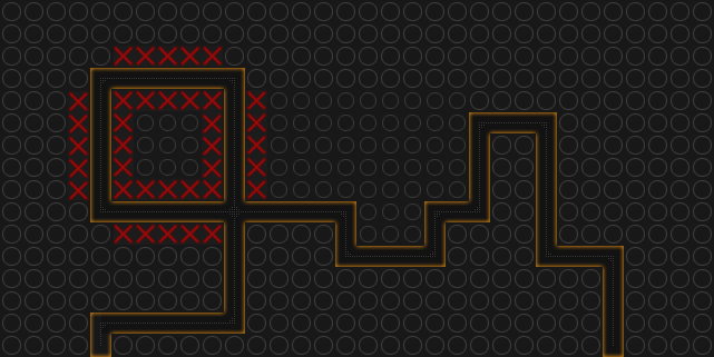
- restrictdd1.png (43.94 KiB) Viewed 17794 times
notice how i made some (lazy to finish) circles slightly smaller, could be even smaller than that... maybe darker too?
Re: Restricted 32x16
Posted:
13.06.2012, 13:21by indeX
I like the first version more.. -_-
Re: Restricted 32x16
Posted:
13.06.2012, 13:36by dcode
I absolutely like the red X's for the blocked spots
Re: Restricted 32x16
Posted:
13.06.2012, 13:47by Bumblebee
I also like the first version best, and i also agree with domitmn that everyone realizes in 2 seconds where you can build.
Re: Restricted 32x16
Posted:
13.06.2012, 14:42by domitmn
Thanks for liking the first version!
It also would have been much easier for me to adjust the circle size or add red X's to the blocked area,
and the quality would be better too (looks a bit blurry to me).
In my opinion the red X's look pretty 'cheap', as if I would have just added the "X" with the map editor,
an was to lazy to think of something different myself....
...and again we are back to a 100% design discussion.
As I was told the path is the most relevant, and why not accept the first design when it was accepted in the first place.
Design discussion will always be endless, there will always be anyone who dislikes this or is oversensitive about some colors etc...
I make design changes if the really improve the graphics or playability, but I don't change something, if I don't see the point.
Red X's because they "make sense" is no argument for a design change in my opinion.
And as you see you already found someone that liked it too, but right now more people like my first version more.
Re: Restricted 32x16
Posted:
13.06.2012, 14:51by dcode
Another Idea would be to mark blocked spots with a red X and buildable areas with the previous gray X. Guess that would be clear enough
Re: Restricted 32x16
Posted:
13.06.2012, 14:56by ALT
domitmn wrote:Red X's because they "make sense" is no argument for a design change in my opinion.
Thats why i told im afraid you go to Microsoft team

Because in your sense it is ok to change mouse cursor into a warning triangle, even when it doesnt make any sense, its just no argument whining about it, because "make sense" is no argument to anything.
domitmn wrote:And as you see you already found someone that liked it too, but right now more people like my first version more.
We can make voting, though. People usually are shy whining about others work, mostly you see positive comments... well, depends on the situation though. But i bet the circles will get more votes... unless you and your friends start registering dozens of accounts just to support your ideology. (which i am expecting to happen btw...).
Re: Restricted 32x16
Posted:
13.06.2012, 14:57by ALT
dcode wrote:Another Idea would be to mark blocked spots with a red X and buildable areas with the previous gray X. Guess that would be clear enough
Still confusing IMO. Everyones first thoughts: Why X? what does it do? OH, red X is blocked... gray X means bloc.. i mean not blocke.. or is it blocked after all? Lets see.. oh its not blocked! Gotcha.
Then that guy plays some other map where gray X is blocked and red X is not blocked (because another artist got an epic idea of using X's)

This is why its not a good idea to abuse common icons.
Colors doesnt matter, there are red maps which you can still build on. And what about blood? is that not buildable space because its red?
Re: Restricted 32x16
Posted:
13.06.2012, 15:10by domitmn
Vote in this forum is never a good idea and no one who supported me on the first design is my "friend"...
Please look in my other map threads. I always tried to put as much feedback into the map as I felt comfortable with,
and I got a lot of "whining" about my maps before.
I like the idea of this map, and can change it to just black and white with standard grid if that would have a chance of getting added...
Re: Restricted 32x16
Posted:
13.06.2012, 15:39by dcode
Maybe
Re: Restricted 32x16
Posted:
13.06.2012, 16:38by domitmn
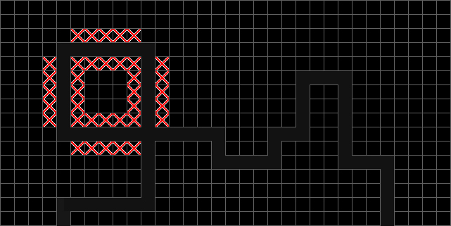
- restricted_simple.jpg (99.82 KiB) Viewed 17762 times
Re: Restricted 32x16
Posted:
13.06.2012, 16:48by dcode
No X's could look like that:
Re: Restricted 32x16
Posted:
13.06.2012, 16:56by domitmn
I know how it could look like, I'm just a bit frustrated and reduced it to a minimal design.
If we go into design details again, your red X's look a bit blurry, too.
Re: Restricted 32x16
Posted:
13.06.2012, 17:18by Bianca1989
Ich weiss nicht was alle hier haben, dass die "X" aussehn als ob die geblockt wären, find ich nämlich überhaupt nicht. An das hab ich nicht mal eine Sekunde gedacht dass die Felder geblockt wären.. Aber würde die Map ohne "X" und "O" lassen.. Also den Vorschlag von Dcode restricted2 find ich gut.
Re: Restricted 32x16
Posted:
13.06.2012, 17:35by dcode
domitmn wrote:I know how it could look like, I'm just a bit frustrated and reduced it to a minimal design.
If we go into design details again, your red X's look a bit blurry, too.
Sorry, I didn't intend to offend you in any way. Just trying to come to a decision finally. I took those red X's from a previous post, as far as i know by ALT
Re: Restricted 32x16
Posted:
13.06.2012, 17:48by domitmn
?
Re: Restricted 32x16
Posted:
13.06.2012, 17:54by ALT
I dont like the red areas TBH... they just seem weird. how about this...
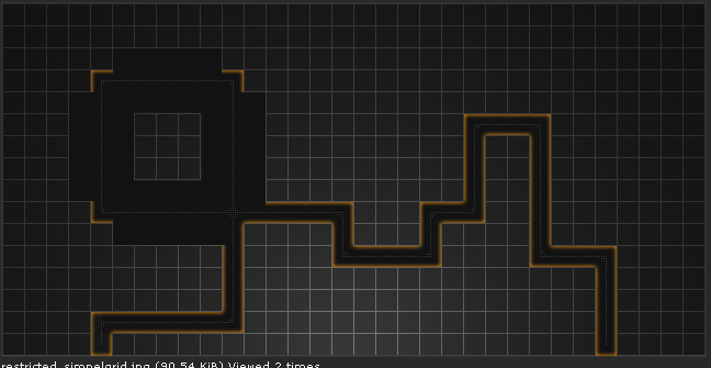
- aasdgaa.png (79.21 KiB) Viewed 17734 times
Re: Restricted 32x16
Posted:
13.06.2012, 17:55by manuel
Really ugly, sorry
Re: Restricted 32x16
Posted:
13.06.2012, 17:58by ALT
To whom are you replying? I think mine is cleaner, no extra fuzz with some weird red spots. In my image it is 100% clear where you can build and where you cant. I like that kind of clearness